Tips for Choosing Calm Colors to Create a Peaceful Home
Creating a peaceful and relaxing environment at home starts with the colors you choose. Calm colors can help reduce stress, improve focus, and make your living space feel welcoming and soothing. Whether you’re refreshing a single room or planning a complete makeover, selecting the right palette plays a vital role. In this post, we’ll explore practical tips and guidance for choosing calm colors that transform your home into a tranquil retreat.
Understanding Calm Colors
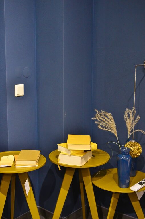
Calm colors are typically soft, muted, and easy on the eyes. They evoke feelings of tranquility and balance, helping to lower anxiety and promote relaxation. Common calm hues include shades of blue, green, soft neutrals, and pastel tones.
Why Choose Calm Colors?
– Reduce Stress: Colors like soft blues and greens can lower heart rates and create a sense of calm.
– Enhance Relaxation: Ideal for bedrooms, living rooms, and spaces where you unwind.
– Create a Balanced Atmosphere: Calm colors work well with other colors and décor styles without overwhelming the senses.
Tips for Choosing Calm Colors for Your Home
1. Consider the Room’s Purpose
Start by thinking about how you use the room. Calm colors work best in areas designed for relaxing or unwinding.
– Bedroom: Soft blues, lavender, and pale gray encourage restfulness.
– Living Room: Warm neutrals and muted greens create a welcoming but peaceful vibe.
– Home Office or Study: Light greens or gentle blues help improve concentration without causing distraction.
2. Use the Color Wheel Wisely
Understanding basic color theory can guide you toward calming shades:
– Choose cool colors, like blues and greens, which are naturally calming.
– Avoid overly bright or saturated colors that can feel stimulating or jarring.
– You can complement calm shades with small accents of warm hues (like soft peach or beige) to add warmth without overpowering.
3. Opt for Muted and Pastel Shades
Colors that are toned down by adding white, gray, or beige tend to be more calming than bold, intense colors.
– Examples include powder blue, sage green, blush pink, and dove gray.
– These shades create a soft, dreamy effect that soothes the mind.
4. Test Samples in Different Lighting
Lighting can dramatically alter how a color looks.
– Paint large swatches on your walls and observe them at different times of day, both natural and artificial light.
– What looks calm in one lighting condition may appear dull or too bright in another.
5. Balance with Neutrals
Combining calm colors with neutral shades like white, cream, tan, or soft gray creates harmony.
– Neutrals serve as a perfect backdrop to highlight calming hues.
– They also help keep the space feeling open and uncluttered.
6. Limit Dark and Intense Colors
While adding contrast is good, too much dark or intense color can disrupt the tranquil mood.
– Use deeper colors sparingly as accents, such as in cushions, curtains, or art pieces.
– Avoid dark shades on large areas like entire walls in rooms meant for relaxation.
7. Consider Texture and Finish
Beyond paint color, texture and finish impact how calm a space feels.
– Matte or eggshell finishes absorb light softly, reinforcing calmness.
– Glossy or shiny finishes can reflect harsh light, making spaces seem less serene.
8. Incorporate Nature-Inspired Colors
Natural colors often feel calming because they remind us of the outdoors.
– Think soft earthy tones like sand, soft moss, sky blue, or stone gray.
– Pair these colors with natural materials like wood, linen, and stone to enhance the sense of peace.
Choosing Color Combinations for a Cohesive Look
Here are some easy-to-use calming color palettes:
– Blue + Soft Gray + White: Classic and fresh, perfect for bedrooms or bathrooms.
– Sage Green + Cream + Light Wood Tones: Earthy and inviting, great for living rooms.
– Lavender + Pale Pink + Warm Beige: Gentle and cozy, excellent for bedrooms or reading nooks.
– Soft Taupe + Muted Aqua + White: Balanced and tranquil, works well in kitchens or offices.
When selecting combinations, remember the 60-30-10 rule:
Use one color for 60% of the room (walls), a second color for 30% (furniture or larger décor), and an accent color for 10% (decorative pieces or trim).
Final Thoughts
Choosing calm colors for your home is about creating a space that supports your well-being and comfort. By considering your room’s purpose, experimenting with soft hues and natural lighting, and balancing your palette with neutrals and textures, you can design interiors that invite peace and relaxation every day.
Feel free to try a few sample colors and take your time deciding—the perfect calm color palette can transform your home into a personal sanctuary.
—
Feel inspired? Don’t hesitate to experiment with different calm color schemes and observe which ones resonate best with your personality and lifestyle. Happy decorating!